Computing slope of series with Pandas and SciPy

Table of Contents
Series with Pandas and SciPy.Computing the slope of a series has numerous applications in fintech:
- Determining whether price action is trending positively or negatively
- Analyzing fundamental data to see if metrics like profit margins are improving
- Measuring the rate of change in any time series data
We’ll be using this function in Part 7 of this series for market stage detection, where identifying trends is critical.
This tutorial is part 6 in a larger series on getting started with fintech and market analysis with Python:
- How to download market data with yfinance and Python
- Rethinking yfinance’s default MultiIndex format
- How to plot candlestick charts with Python and mplfinance
- How to compute Simple Moving Averages (SMAs) for trading with Python and Pandas
- Finding consecutive integer groups in arrays with Python and NumPy
- Computing slope of series with Pandas and SciPy (this tutorial)
- Market stage detection with Python and Pandas
- Implementing TradingView’s Stochastic RSI indicator in Python
- Introduction to position sizing
- Risk/Reward analysis and position sizing with Python
Configuring your development environment #
Before we dive in, let’s set up our Python environment with the packages we’ll need:
$ pip install numpy scipy pandas yfinance matplotlib mplfinance
Here’s what each package does:
- NumPy: Fundamental package for scientific computing in Python
- SciPy: Library used for scientific and technical computing (we’ll use it for linear regression, allowing us to compute the slope of an input series)
- Pandas: Data manipulation and analysis library that we’ll use for working with
Seriesobjects - yfinance: Yahoo Finance API wrapper for fetching market data
- matplotlib: Plotting library that serves as the foundation for mplfinance
- mplfinance: Specialized financial plotting library for candlestick charts and other market visualizations
Implementing our method to compute slope of series #
Let’s start by importing the necessary packages:
# import the necessary packages
from datetime import datetime
from scipy import stats
import mplfinance as mpf
import yfinance as yf
import pandas as pd
import numpy as np
Our imports include:
datetime: To specify date ranges for our market data queriesstats: Contains the SciPy linear regression function we’ll use for slope calculationmplfinance: For creating financial charts with our slope visualizationyfinance: For downloading historical market datapandas: For data manipulation and working withSeriesobjectsnumpy: For numerical operations and handling special cases (NaN values)
Now, let’s implement our calculate_slope method:
def calculate_slope(series: pd.Series) -> float:
    # check to see if less than two points were provided
    if len(series) < 2:
        # return NaN since slope cannot be computed
        return np.nan

    # check to see if performing linear regression would cause a division by
    # zero error, including (1) *any* of the data points in the series being
    # NaN, or (2) *all* values in the series being equal
    if series.isna().any() or np.all(series == series.iloc[0]):
        # return NaN
        return np.nan

    # compute and return the slope for the input data points
    return stats.linregress(np.arange(0, len(series)), series).slope
The calculate_slope function takes a Pandas Series as input and returns a float representing the slope.
Here’s what’s happening:
First, we check if there are at least two points in the series. We need a minimum of two points to compute a slope — if we have fewer, we return
np.nan(Not a Number).Next, we check for two potential issues that would cause a division by zero error:
- If any values in the series are NaN
- If all values in the series are identical
In either case, we can’t compute a meaningful slope, so we return
np.nan.Finally, we use SciPy’s
stats.linregressfunction to compute the slope. We create an array of indices(0, 1, 2, ...)usingnp.arange()to represent the x-axis positions, then use our series values as the y-axis data.
The function returns the slope value, which tells us how much the y-value (price or other metric) changes, on average, for each increment in the x-axis (time).
Computing slope of series with Pandas and SciPy #
Let’s demo our calculate_slope function by computing the slope of stock prices.
Positive slope #
First, let’s examine a stock with a positive price trend:
# define the ticker we are interested in
ticker = "CLS"

# set the start and end date of history requests
end_date = datetime(year=2025, month=1, day=22)
start_date = datetime(year=2024, month=10, day=1)
Here we’ve:
- Set our ticker symbol to “CLS”
- Defined a date range from October 1, 2024, to January 22, 2025
Next, we’ll download the market data:
# download market data
df = yf.download(
    tickers=ticker,
    start=start_date,
    end=end_date,
    interval="1d",
    group_by="ticker",
    auto_adjust=True,
    progress=False
)
We’re using yfinance to download daily price data for CLS with auto-adjustment for splits and dividends.
Now, let’s compute the slope:
# compute the slope of the series
slope = calculate_slope(df[ticker]["Close"])
slope
Which will output:
np.float64(0.7419833146132432)
Here we are computing the slope of the closing prices.
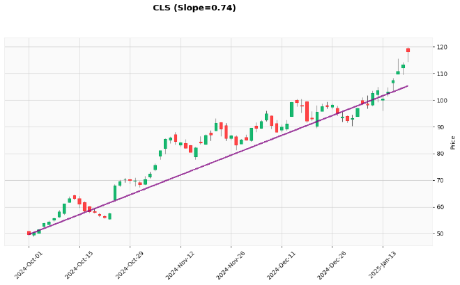
Notice that the result is positive (0.74), which indicates an upward price trend. This means that, on average, the price increases by 0.74 units per day.
To visualize this slope alongside the price data, we’ll calculate the start and end points for our trend line:
# compute the start and end price based on the value of our slope
start_price = df[ticker]["Close"].iloc[0]
end_price = start_price + (slope * (len(df) - 1))
In this code block, we:
- Set the start price to the first closing price in our data
- Calculate the end price by adding the slope times the number of days to the start price
Finally, let’s plot the candlestick chart with our slope line:
# plot the OHLCV bars, along with the slope
mpf.plot(
    df[ticker],
    type="candle",
    style="yahoo",
    figsize=(14, 7),
    title=f"{ticker} (Slope={slope:0.2f})",
    alines=dict(
        alines=[(df.index[0], start_price), (df.index[-1], end_price)],
        colors=["purple"],
        linewidths=1.5,
        alpha=0.75
    )
)
The output chart sould look like this:

In the chart above:
type="candle"specifies we want a candlestick chartstyle="yahoo"uses the Yahoo Finance styling (green for up days, red for down days)figsize=(14, 7)sets the output figure sizetitledisplays the ticker and formatted slope valuealinesadds annotation lines to our chart:- We define a line from our start date/price to our end date/price
- The line is colored purple with a width of 1.5 and 75% opacity
The purple line clearly shows the positive slope, confirming that CLS has been in an uptrend during this period.
Negative slope #
Now, let’s look at a stock with a negative price trend:
# define the ticker we are interested in
ticker = "NVDA"

# set the start and end date of history requests
end_date = datetime(year=2025, month=3, day=10)
start_date = datetime(year=2025, month=2, day=15)
We’ll examine NVDA, which had a downturn in early 2025, using data from February 15, 2025 to March 10, 2025.
Let’s download the data:
# download market data
df = yf.download(
    tickers=ticker,
    start=start_date,
    end=end_date,
    interval="1d",
    group_by="ticker",
    auto_adjust=True,
    progress=False
)
And then compute the slope:
# compute the slope of the series
slope = calculate_slope(df[ticker]["Close"])
slope
Which will give us:
np.float64(-2.4046578208168783)
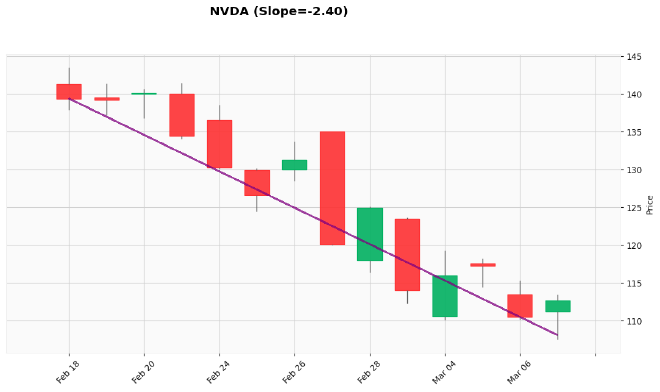
The slope is negative (-2.40), confirming that NVDA has been in a downtrend. The price is declining by approximately 2.40 units per day on average.
Again, let’s prepare our data for visualization:
# compute the start and end price based on the value of our slope
start_price = df[ticker]["Close"].iloc[0]
end_price = start_price + (slope * (len(df) - 1))
And plot the chart:
# plot the OHLCV bars, along with the slope
mpf.plot(
    df[ticker],
    type="candle",
    style="yahoo",
    figsize=(14, 7),
    title=f"{ticker} (Slope={slope:0.2f})",
    alines=dict(
        alines=[(df.index[0], start_price), (df.index[-1], end_price)],
        colors=["purple"],
        linewidths=1.5,
        alpha=0.75
    )
)
Resulting in the following image:

The chart clearly shows NVDA’s downward trend, with the purple slope line confirming the negative direction.
Limitations of slope calculation for non-linear data #
While calculating the slope is a useful technique, it comes with some important limitations that every quantitative trader should understand.
Linear approximation of non-linear data #
The most significant limitation is that our calculate_slope function performs a linear regression, which attempts to fit a straight line to the data. However, financial time series are rarely perfectly linear in nature.
When applied to highly non-linear data, a simple slope calculation:
- Oversimplifies complex patterns: Market movements often follow non-linear patterns with acceleration, deceleration, or cyclical components
- Misses inflection points: Critical turning points in the market might be obscured by a linear approximation
- Becomes less meaningful over longer periods: The longer the time period, the less likely the data follows a linear trend
For example, consider a stock that’s in the middle of a parabolic move or a head-and-shoulders pattern — a single slope value simply can’t capture these complex formations.
Sensitivity to outliers #
Another limitation is that linear regression is sensitive to outliers. A single extreme price movement (like an earnings surprise or market shock) can significantly impact the calculated slope, potentially giving a misleading impression of the overall trend.
Time dependency #
The slope calculation treats all data points equally, regardless of when they occurred.
In financial markets, more recent data points are often more relevant than older ones. Our simple implementation doesn’t account for this time dependency.
Addressing these limitations #
To address these limitations, you might consider:
- Piecewise linear approximation: Break the time series into smaller segments where the linear approximation is more accurate
- Non-linear regression models: Use polynomial regression, splines, or other non-linear models for more complex patterns
- Exponential weighting: Give more weight to recent data points in your regression
- Robust regression methods: Use techniques that are less sensitive to outliers
- Complementary indicators: Use slope in conjunction with other indicators that capture non-linear aspects of the data
Despite these limitations, slope calculation remains a valuable tool when used appropriately and with an understanding of its constraints.
Where else can slope calculation be used in fintech applications? #
Slope calculation is a versatile tool in quantitative finance and technical analysis (although it’s not perfect — especially for non-linear data).
Here are some common applications:
- Rate of Change Indicators: Calculate the slope of technical indicators to determine their momentum
- Trend Strength Measurement: Use slope values to quantify trend strength in different time periods
- Support/Resistance Detection: Identify the slope of support and resistance lines
- Divergence Analysis: Compare slopes of price action versus technical indicators to spot divergences
- Sector Rotation Analysis: Compare slopes across different sectors to identify market rotation
- Fundamental Analysis: Calculate slopes of quarterly earnings, revenue growth, or margin expansion
- Yield Curve Analysis: Measure the steepness of different segments of yield curves
- Volatility Regime Detection: Identify changes in volatility by measuring the slope of volatility indicators
- Risk Management: Monitor the slope of drawdown to adjust position sizing dynamically
Exercises #
Here are some exercises to deepen your understanding of slope calculation:
Normalize slope values: Create a variation of the function that normalizes slope values to make them comparable across different securities
Create a slope-based indicator: Develop a technical indicator that signals buy/sell conditions based on slope changes
Implement a moving slope: Calculate a rolling slope (similar to a moving average) and plot it as a separate indicator
Slope threshold detection: Write a function that detects when a slope crosses certain thresholds (e.g., from positive to negative)
Compare with other trend indicators: Plot the slope alongside traditional trend indicators like ADX or MACD to compare effectiveness
Final thoughts #
Computing the slope of a series gives us a quantitative measure of trend direction and strength, making it a valuable tool in our fintech and trading arsenal.
While many traders rely on visual assessment or complex indicators to identify trends, the simple calculation of slope provides a clear, numerical representation of price movement.
The calculate_slope function we’ve developed is not only useful for price data but can be applied to any time series, from technical indicators to fundamental metrics, giving us insights into how these values are changing over time.
In the next tutorial, we’ll build on this knowledge to implement market stage detection using Python and Pandas, where slope calculation will play a crucial role in identifying trend direction and strength.