Computing Simple Moving Averages (SMAs) for trading with Python and Pandas

Table of Contents
By the end of this guide, you’ll be able to:
- Calculate SMAs across multiple timeframes (daily, weekly, and monthly)
- Visualize these moving averages alongside price data using candlestick charts
- Understand how to identify golden crosses and death crosses
- Interpret how prices interact with moving averages (support/resistance)
- Apply these concepts to any ticker symbol using clean, reusable code
Whether you’re building a trading algorithm or simply analyzing market data, moving averages provide invaluable insights into price trends while filtering out market noise.
This skill is essential for anyone looking to make data-driven trading decisions or build automated trading systems.
This tutorial is part 4 in a larger series on getting started with fintech and market analysis with Python:
- How to download market data with yfinance and Python
- Rethinking yfinance’s default MultiIndex format
- How to plot candlestick charts with Python and mplfinance
- How to compute Simple Moving Averages (SMAs) for trading with Python and Pandas (this tutorial)
- Finding consecutive integer groups in arrays with Python and NumPy
- Computing slope of series with Pandas and SciPy
- Market stage detection with Python and Pandas
- Implementing TradingView’s Stochastic RSI indicator in Python
- Introduction to position sizing
- Risk/Reward analysis and position sizing with Python
Configuring your development environment #
Before we dive in, let’s set up our Python environment with the packages we’ll need:
$ pip install numpy pandas yfinance matplotlib mplfinance seaborn
Here’s what each package does:
- numpy — The foundation for numerical computing in Python
- pandas — Provides high-performance, easy-to-use data structures and data analysis tools
- yfinance — Allows us to download historical market data from the Yahoo Finance API
- matplotlib — The workhorse plotting library that gives us control over visualizations
- mplfinance — A specialized matplotlib extension for financial plots, including candlestick charts
- seaborn — Adds aesthetic improvements to matplotlib visualizations
With our development environment configured, we can move to learning how to create stock charts with Python.
Creating a helper method to fetch market data #
Let’s start by importing our necessary packages:
# import the necessary packages
from datetime import timedelta
from datetime import datetime
import matplotlib.pyplot as plt
import mplfinance as mpf
import seaborn as sns
import yfinance as yf
import pandas as pd
datetimeandtimedelta— For handling date ranges and calculationsmatplotlib.pyplot— For creating plots and visualizationsmplfinance— For financial-specific plots like candlestick chartsseaborn— For enhanced visualization stylingyfinance— To fetch stock market datapandas— For data manipulation and analysis
Next, let’s define a helper function that will fetch our market data and restructure it to use row-based indexes instead of column indexes (as discussed in our previous tutorial), thereby making our moving average calculations easier and more straightforward:
def fetch_ohlcv_history(
        ticker: str,
        start_date: datetime,
        end_date: datetime,
        interval: str
) -> pd.DataFrame:
    # download the OHLCV market data for the ticker
    df = yf.download(
        tickers=ticker,
        start=start_date,
        end=end_date,
        interval=interval,
        auto_adjust=True,
        progress=False
    )

    # restructure the default multi-index dataframe to our preferred format
    df = df.stack(level="Ticker", future_stack=True)
    df.index.names = ["Date", "Symbol"]
    df = df[["Open", "High", "Low", "Close", "Volume"]]
    df = df.swaplevel(0, 1)
    df = df.sort_index()

    # return the dataframe
    return df
This helper function:
- Downloads market data using
yfinance(which we covered in detail in our first tutorial of this series) - Transforms the default DataFrame structure into our preferred multi-index format (explained thoroughly in our second tutorial)
The function returns a clean DataFrame containing OHLCV (Open, High, Low, Close, Volume) data for the specified ticker and time period.
Configuring our date range and ticker #
Let’s set up our ticker and date range for analysis:
# set the name of the ticker we want to download market data for along with
# the end date for our OHLCV history requests
ticker = "AAPL"
end_date = datetime(year=2025, month=3, day=1)
For this tutorial, we’ll analyze Apple Inc. (AAPL) up to March 1, 2025.
Computing daily 50 and 200 moving averages #
Let’s start by fetching daily market data for AAPL:
# fetch daily market data for the ticker
df_daily = fetch_ohlcv_history(
    ticker=ticker,
    start_date=end_date - timedelta(days=365 * 2),
    end_date=end_date,
    interval="1d"
)
df_daily
The resulting DataFrame should look something like:
| Price | Open | High | Low | Close | Volume | |
|---|---|---|---|---|---|---|
| Symbol | Date | |||||
| AAPL | 2023-03-02 | 142.938524 | 145.245263 | 142.463305 | 144.453247 | 52238100 |
| 2023-03-03 | 146.561942 | 149.601298 | 145.859039 | 149.522095 | 70732300 | |
| 2023-03-06 | 152.254550 | 154.739500 | 151.927858 | 152.294159 | 87558000 | |
| 2023-03-07 | 152.165450 | 152.492157 | 149.621117 | 150.086426 | 56182000 | |
| 2023-03-08 | 151.284336 | 151.937750 | 150.314125 | 151.343735 | 47204800 | |
| ... | ... | ... | ... | ... | ... | |
| 2025-02-24 | 244.929993 | 248.860001 | 244.419998 | 247.100006 | 51326400 | |
| 2025-02-25 | 248.000000 | 250.000000 | 244.910004 | 247.039993 | 48013300 | |
| 2025-02-26 | 244.330002 | 244.979996 | 239.130005 | 240.360001 | 44433600 | |
| 2025-02-27 | 239.410004 | 242.460007 | 237.059998 | 237.300003 | 41153600 | |
| 2025-02-28 | 236.949997 | 242.089996 | 230.199997 | 241.839996 | 56833400 |
Now that we have our daily data, let’s compute the 50-day and 200-day moving averages:
# compute the daily 50MA
df_daily["50MA"] = df_daily.groupby(level="Symbol")["Close"].transform(
    lambda x: x.rolling(window=50).mean()
)

# compute the daily 200MA
df_daily["200MA"] = df_daily.groupby(level="Symbol")["Close"].transform(
    lambda x: x.rolling(window=200).mean()
)
The 50-day and 200-day moving averages are among the most widely used indicators by traders and investors. The 50MA reflects medium-term trends, while the 200MA shows long-term trends.
Their crossovers (known as “golden crosses”, where the 50MA crosses above the 200MA, and “death crosses”, where the 50MA crosses below the 200MA) are considered significant trading signals by many market participants.
Let’s break down what’s happening in this code:
- First, we group the DataFrame by the
Symbol(i.e., ticker) creating groups of sub-DataFrames - Then, we grab just the
Closecolumn - For each group, we call the
transformmethod, which takes the sub-DataFrame and computes a rolling mean with a window of 50 (or 200) days - The result is stored in a new column named
50MA(or200MA)
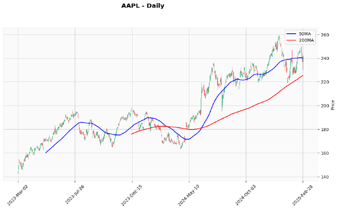
Now, let’s visualize our daily data with these moving averages:
# grab the sub-dataframe for the ticker
df = df_daily.xs(ticker)

# construct additional plots for the MAs
addt_plots = [
    mpf.make_addplot(df["50MA"], color="blue", width=1.5, label="50MA"),
    mpf.make_addplot(df["200MA"], color="red", width=1.5, label="200MA"),
]

# plot the daily OHLCV and MAs
mpf.plot(
    df,
    type="candle",
    style="yahoo",
    addplot=addt_plots,
    figsize=(14, 7),
    title=f"{ticker} - Daily"
)
Our output plot should look like this:

To create this visualization:
- We first extract a cross-section of our DataFrame for just the AAPL ticker using
df_daily.xs(ticker) - We create additional plot lines for our moving averages using
make_addplot:- Each line has a specific color (blue for 50MA, red for 200MA)
- We set a line width of
1.5to make them stand out - Labels are added for the legend
- Finally, we plot everything with
mpf.plot, specifying:- Candlestick chart type
- Yahoo style
- Our additional plot lines
- Figure size
- Title
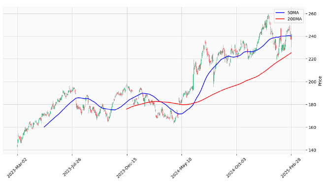
You’ll notice that the MA lines don’t extend across the entire chart. That’s because the first 49 days (for 50MA) and 199 days (for 200MA) don’t have enough prior data points to calculate a complete moving average, resulting in NaN values.
Additionally, pay special attention to the crossovers in this chart!
- When the 50MA (blue) crosses above the 200MA (red), that’s a “golden cross” — traditionally considered a bullish signal
- Conversely, when the 50MA crosses below the 200MA, that’s a “death cross” — often viewed as bearish
Notice how the price tends to find support at these moving averages during uptrends, and resistance during downtrends. This is why traders pay such close attention to these lines!
Computing weekly 10 and 40 moving averages #
Let’s move on to computing moving averages on a weekly timeframe. Weekly charts can filter out more noise and help identify longer-term trends.
We’ll start by downloading weekly market data:
# fetch weekly market data for the ticker
df_weekly = fetch_ohlcv_history(
    ticker=ticker,
    start_date=end_date - timedelta(days=365 * 3),
    end_date=end_date,
    interval="1wk"
)
df_weekly.tail()
Which will gives us the following DataFrame:
| Price | Open | High | Low | Close | Volume | |
|---|---|---|---|---|---|---|
| Symbol | Date | |||||
| AAPL | 2025-01-27 | 223.773975 | 246.918527 | 223.734011 | 235.740814 | 372790500 |
| 2025-02-03 | 229.737414 | 233.743004 | 225.452117 | 227.380005 | 227383400 | |
| 2025-02-10 | 229.317883 | 245.280329 | 226.950475 | 244.331375 | 226587600 | |
| 2025-02-17 | 244.149994 | 248.690002 | 241.839996 | 245.550003 | 166541000 | |
| 2025-02-24 | 244.929993 | 250.000000 | 230.199997 | 241.839996 | 241760300 |
Now, let’s compute the 10-week and 40-week moving averages:
# compute the weekly 10MA
df_weekly["10MA"] = df_weekly.groupby(level="Symbol")["Close"].transform(
    lambda x: x.rolling(window=10).mean()
)

# compute the weekly 40MA
df_weekly["40MA"] = df_weekly.groupby(level="Symbol")["Close"].transform(
    lambda x: x.rolling(window=40).mean()
)
df_weekly.tail()
| Price | Open | High | Low | Close | Volume | 10MA | 40MA | |
|---|---|---|---|---|---|---|---|---|
| Symbol | Date | |||||||
| AAPL | 2025-01-27 | 223.773975 | 246.918527 | 223.734011 | 235.740814 | 372790500 | 240.470609 | 222.363760 |
| 2025-02-03 | 229.737414 | 233.743004 | 225.452117 | 227.380005 | 227383400 | 239.501674 | 223.485306 | |
| 2025-02-10 | 229.317883 | 245.280329 | 226.950475 | 244.331375 | 226587600 | 239.677483 | 225.038847 | |
| 2025-02-17 | 244.149994 | 248.690002 | 241.839996 | 245.550003 | 166541000 | 239.446735 | 226.446747 | |
| 2025-02-24 | 244.929993 | 250.000000 | 230.199997 | 241.839996 | 241760300 | 238.209683 | 227.759156 |
The 10-week and 40-week moving averages are particularly significant for swing traders and position traders.
- The 10-week MA helps identify intermediate trends
- While the 40-week MA (roughly equivalent to the 200-day MA) shows long-term trends on the weekly timeframe
Many professional traders actually prefer these weekly MAs over daily ones, as they provide stronger support and resistance levels and generate fewer false signals.
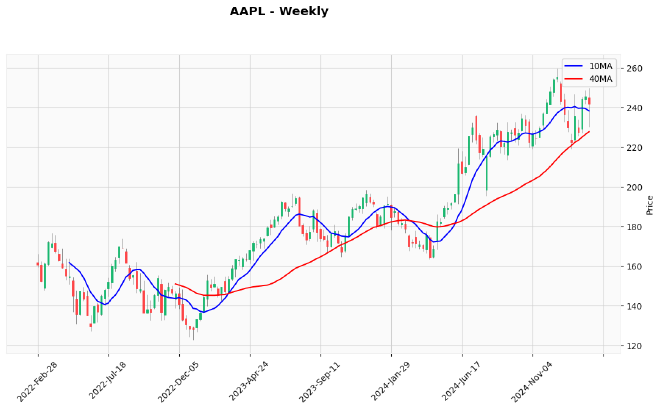
Let’s visualize the weekly data with these MAs:
# grab the sub-dataframe for the ticker
df = df_weekly.xs(ticker)

# construct additional plots for the MAs
addt_plots = [
    mpf.make_addplot(df["10MA"], color="blue", width=1.5, label="10MA"),
    mpf.make_addplot(df["40MA"], color="red", width=1.5, label="40MA"),
]

# plot the daily OHLCV and MAs
mpf.plot(
    df,
    type="candle",
    style="yahoo",
    addplot=addt_plots,
    figsize=(14, 7),
    title=f"{ticker} - Weekly"
)
Which results in the following chart:

Just as with daily charts, golden crosses (10MA crossing above 40MA) and death crosses (10MA crossing below 40MA) on weekly charts can signal major trend changes.
However, unlike daily MAs, these weekly signals are often considered more reliable and significant than daily signals.
Notice how price respects these moving averages as support during uptrends and resistance during downtrends. The interaction between price and these moving averages provides valuable information about the strength of the prevailing trend.
Computing a monthly 10 moving average #
Finally, let’s look at an even longer timeframe: monthly data.
Monthly charts are excellent for identifying major market cycles and long-term trends.
We’ll start by fetching monthly OHLCV data from the Yahoo Finance API:
# fetch monthly market data for the ticker
df_monthly = fetch_ohlcv_history(
    ticker=ticker,
    start_date=end_date - timedelta(days=365 * 5),
    end_date=end_date,
    interval="1mo"
)
df_monthly.tail()
Here’s a subset of the monthly data:
| Price | Open | High | Low | Close | Volume | |
|---|---|---|---|---|---|---|
| Symbol | Date | |||||
| AAPL | 2024-10-01 | 229.015968 | 236.968466 | 220.843951 | 225.413895 | 930736000 |
| 2024-11-01 | 220.484735 | 237.287749 | 219.227507 | 236.808807 | 891640600 | |
| 2024-12-01 | 237.009422 | 259.814351 | 236.899542 | 250.144974 | 977916100 | |
| 2025-01-01 | 248.656607 | 248.826433 | 219.139072 | 235.740814 | 1200291700 | |
| 2025-02-01 | 229.737410 | 249.725428 | 225.452114 | 241.574387 | 862272300 |
Let’s compute the 10-month moving average:
# compute the monthly 10MA
df_monthly["10MA"] = df_monthly.groupby(level="Symbol")["Close"].transform(
    lambda x: x.rolling(window=10).mean()
)
df_monthly.tail()
Which gives us the following DataFrame:
| Price | Open | High | Low | Close | Volume | 10MA | |
|---|---|---|---|---|---|---|---|
| Symbol | Date | ||||||
| AAPL | 2024-10-01 | 229.015968 | 236.968466 | 220.843951 | 225.413895 | 930736000 | 201.190659 |
| 2024-11-01 | 220.484735 | 237.287749 | 219.227507 | 236.808807 | 891640600 | 206.541591 | |
| 2024-12-01 | 237.009422 | 259.814351 | 236.899542 | 250.144974 | 977916100 | 213.588960 | |
| 2025-01-01 | 248.656607 | 248.826433 | 219.139072 | 235.740814 | 1200291700 | 220.095633 | |
| 2025-02-01 | 229.737410 | 249.725428 | 225.452114 | 241.574387 | 862272300 | 227.300121 |
The 10-month moving average is a powerful tool for long-term investors. Many successful investors use it as a simple method to determine when to be in or out of the market. It effectively filters out short-term volatility and helps identify the primary trend.
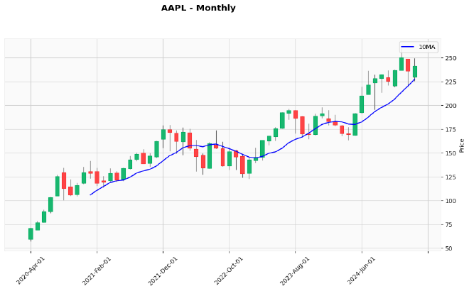
Finally, let’s visualize our monthly data with the 10-month MA:
# grab the sub-dataframe for the ticker
df = df_monthly.xs(ticker)

# construct additional plots for the MAs
addt_plots = [
    mpf.make_addplot(df["10MA"], color="blue", width=1.5, label="10MA"),
]

# plot the daily OHLCV and MAs
mpf.plot(
    df,
    type="candle",
    style="yahoo",
    addplot=addt_plots,
    figsize=(14, 7),
    title=f"{ticker} - Monthly"
)
Resulting in the following plot:

A popular strategy among long-term investors is to go long on broad market ETFs like SPY (S&P 500) when the price is trading above its 10-month MA, and move to cash when the price drops below it.
This simple rule has historically helped investors avoid major market downturns while capturing most of the upside.
I encourage you to backtest this strategy on different market indices and see how it performs over various market cycles.
Exercises #
Before we wrap up, try these exercises to reinforce what you’ve just learned:
Alternative MA periods: Compute and plot the 20-day and 100-day moving averages for AAPL. How do these compare to the 50 and 200 MAs we analyzed? Do they provide earlier signals or more false signals?
Cross detection function: Create a function that automatically identifies golden crosses and death crosses in your data. Use this to find all such events in AAPL’s price history over the past 5 years, and analyze the subsequent price action.
Simple MA strategy implementation: Code a basic trading strategy that buys when price crosses above a specified MA and sells when it crosses below. Backtest this strategy with different MA periods and compare the results to a simple buy-and-hold approach.
MA combination performance: Compare the performance of different MA combinations (e.g., 20/50, 50/200, 10/40) across various tickers to see which gives better signals for particular types of stocks. Do growth stocks respond differently than value stocks?
EMA vs SMA comparison: Modify our code to calculate exponential moving averages (EMAs) instead of simple moving averages and compare the results. Do EMAs provide earlier signals? Are they more or less prone to whipsaws?
Remember, the best way to master these technical analysis concepts is through hands-on practice—experimenting with different parameters and market conditions will help you develop a more intuitive understanding of how moving averages can enhance your trading decisions.
Final thoughts #
In this tutorial, we’ve explored how to compute and visualize simple moving averages across different timeframes using Python, Pandas, and mplfinance.
Moving averages are among the most versatile and widely-used technical indicators in trading. They help identify trends, provide potential support and resistance levels, and generate entry and exit signals through their crossovers.
By analyzing multiple timeframes (daily, weekly, and monthly), we can gain a more comprehensive understanding of market trends and make more informed trading decisions.
The code we’ve written is concise yet powerful, leveraging Pandas’ groupby and transform functions to efficiently calculate moving averages even on multi-index DataFrame structures.
In the next tutorial, we’ll dive into finding consecutive integer groups in arrays with Python and NumPy, which will help us identify and analyze streak patterns in price movements.