Plotting stock charts (OHLC) with matplotlib and mplfinance
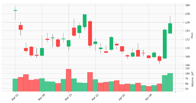
Table of Contents
This tutorial builds on our previous lessons about downloading market data with yfinance and rethinking yfinance’s default MultiIndex DataFrames.
Today, we’re taking things to the next level by learning how to create candlestick charts, one of fundamental tools in any traders toolbox.
Whether you’re tracking market trends, analyzing support and resistance levels, or just trying to make sense of price volatility, visual representation is your most powerful ally. And when it comes to stock market visualization, nothing beats the information density of a good candlestick chart.
This tutorial is part 3 in my series on getting started with fintech and market analysis with Python:
- How to download market data with yfinance and Python
- Rethinking yfinance’s default MultiIndex format
- How to plot candlestick charts with Python and mplfinance (this tutorial)
- How to compute Simple Moving Averages (SMAs) for trading with Python and Pandas
- Finding consecutive integer groups in arrays with Python and NumPy
- Computing slope of series with Pandas and SciPy
- Market stage detection with Python and Pandas
- Implementing TradingView’s Stochastic RSI indicator in Python
- Introduction to position sizing
- Risk/Reward analysis and position sizing with Python
Configuring your development environment #
Before diving in, let’s set up our Python environment with the necessary packages:
$ pip install numpy pandas yfinance matplotlib mplfinance seaborn
Here’s what each package does:
- numpy — The foundational package for numerical computing in Python
- pandas — Gives us powerful DataFrame objects for manipulating and analyzing market data
- yfinance — Allows us to download historical market data from the Yahoo Finance API
- matplotlib — The workhorse plotting library that gives us control over visualizations
- mplfinance — A specialized matplotlib extension for financial plots, including candlestick charts
- seaborn — Adds aesthetic improvements to matplotlib visualizations
With our development environment configured, we can move to learning how to create stock charts with Python.
Downloading market data #
Let’s start by importing our required Python packages:
# import the necessary packages
from datetime import timedelta
from datetime import datetime
import matplotlib.pyplot as plt
import mplfinance as mpf
import seaborn as sns
import yfinance as yf
These imports give us everything we need to download, manipulate, and visualize stock data:
datetimeandtimedelta— For managing date ranges for our data requestsmatplotlib.pyplot— For creating basic plotsmplfinance— For financial-specific chart types like candlesticksseaborn— For enhanced visual stylingyfinance— For downloading the actual market data
Now let’s set up our date range and ticker:
# set the start and end dates for our market data request to be TTM
end_date = datetime(year=2025, month=3, day=1)
start_date = end_date - timedelta(days=365)

# set the name of the ticker we want to download market data for
ticker = "AAPL"
We’re looking at the “trailing twelve months” (TTM) of data for Apple (AAPL), going back one year from March 1, 2025.
This time range gives us a solid dataset to work with, capturing both short-term fluctuations and longer-term trends.
With our parameters defined, let’s download market data for our ticker:
# download market data
df = yf.download(
    tickers=ticker,
    start=start_date,
    end=end_date,
    interval="1d",
    group_by="ticker",
    auto_adjust=True,
    progress=False
)
As well as transforms the data into our preferred MultiIndex structure (as covered in our previous tutorial):
# restructure the default multi-index dataframe to our preferred format
df = df.stack(level="Ticker", future_stack=True)
df.index.names = ["Date", "Symbol"]
df = df[["Open", "High", "Low", "Close", "Volume"]]
df = df.swaplevel(0, 1)
df = df.sort_index()
df
The output DataFrame should look like the following:
| Price | Open | High | Low | Close | Volume | |
|---|---|---|---|---|---|---|
| Symbol | Date | |||||
| AAPL | 2024-03-01 | 178.706190 | 179.681580 | 176.546390 | 178.815674 | 73488000 |
| 2024-03-04 | 175.322137 | 176.068613 | 172.973228 | 174.277084 | 81510100 | |
| 2024-03-05 | 169.957503 | 171.231486 | 168.822861 | 169.320511 | 95132400 | |
| 2024-03-06 | 170.256065 | 170.435227 | 167.887245 | 168.325180 | 68587700 | |
| 2024-03-07 | 168.355054 | 169.927630 | 167.698167 | 168.205765 | 71765100 | |
| ... | ... | ... | ... | ... | ... | |
| 2025-02-24 | 244.929993 | 248.860001 | 244.419998 | 247.100006 | 51326400 | |
| 2025-02-25 | 248.000000 | 250.000000 | 244.910004 | 247.039993 | 48013300 | |
| 2025-02-26 | 244.330002 | 244.979996 | 239.130005 | 240.360001 | 44433600 | |
| 2025-02-27 | 239.410004 | 242.460007 | 237.059998 | 237.300003 | 41153600 | |
| 2025-02-28 | 236.949997 | 242.089996 | 230.199997 | 241.839996 | 56833400 |
The resulting DataFrame contains our OHLCV (Open, High, Low, Close, Volume) data, properly structured and ready for visualization.
Plotting closing prices with matplotlib #
Let’s start with something simple — a basic line plot of closing prices:
# initialize an empty figure
plt.figure(figsize=(10, 6))
plt.grid(alpha=0.5)

# plot the closing prices
plt.plot(
    df.xs(ticker).index,
    df.xs(ticker)["Close"],
    color="blue",
    linewidth=1.5
)

# set the plot title and axis labels
plt.title(f"{ticker} Closing Price [TTM]")
plt.xlabel("Date")
plt.ylabel("Price ($)")

# finish constructing the plot
plt.xticks(rotation=45)
plt.tight_layout()

# show the plot
plt.show()
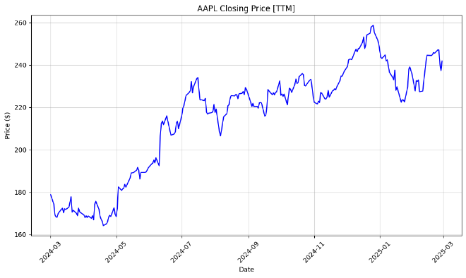
The resulting plot should look like:
Let’s break down what this code does:
- We create a new figure with a specific size and add a subtle background grid
- We plot the closing price against dates using
df.xs(ticker)to extract just the AAPL data from ourMultiIndexDataFrame - We customize the appearance with a title, axis labels, and date labels
- Finally, we call
tight_layout()to ensure everything fits nicely, andshow()to display the chart
The resulting plot gives us a clean visualization of AAPL’s price movement over the past year, showing the upward trend with some volatility along the way.
Plotting candlestick chart of OHLC data #
Anatomy of a candlestick #
While line charts are nice for tracking overall trends, they only show one dimension of price data (the closing price). But the stock market is much more complex than that!
Each trading day contains four critical price points:
- Open — The price at which the stock started trading that day
- High — The highest price reached during the day
- Low — The lowest price reached during the day
- Close — The final price when the market closed
Candlestick charts display all four of these values in a compact, informative visualization:
- The body of the candle shows the range between open and close
- The wicks (or shadows) show the full range from high to low
- The color indicates whether the stock closed higher (green/white) or lower (red/black) than it opened
The following image provides a nice visualization of both a bullish and bearish candle:
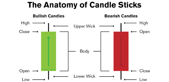
Take the time now to study the image for a few moments to ensure you understand it.
Using mplfinance to a candlestick chart #
Let’s create our first candlestick chart using mplfinance:
# plot the open, high, low, and close candlestick data
mpf.plot(
    df.xs(ticker),
    type="candle",
    style="yahoo",
    figsize=(14, 7),
    title=f"{ticker} - Basic Candlestick Chart"
)
Which results in the following plot:
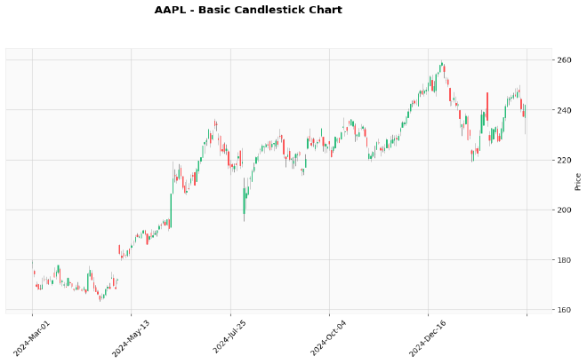
This code is amazingly simple compared to what it accomplishes!
To create the above plot, we’re using mpf.plot() and passing in:
- Our cross-section of AAPL data from the DataFrame
type="candle"to specify we want a candlestick chartstyle="yahoo"for a Yahoo Finance-like appearance- Our figure size and title
The beauty of mplfinance is that it automatically detects the OHLC columns in our DataFrame and creates the appropriate visualization.
Overall, this leads to a much richer view of AAPL’s price action:
- Green candles show days when the stock price increased
- Red candles indicate days with price decreases
- Long wicks reveal volatile days with large price swings
- We can easily spot days with gaps between the previous close and current open
This visualization gives us a much deeper understanding of market behavior than a simple line chart.
Adding volume to the candlestick chart with mplfinance #
Volume is another crucial piece of market information—it tells us how many shares changed hands, indicating the level of participation and conviction behind price moves.
Let’s enhance our chart by adding volume data:
# include volume in the candlestick chart
mpf.plot(
    df.xs(ticker),
    type="candle",
    style="yahoo",
    figsize=(14, 7),
    volume=True,
    title=f"{ticker} - Candlestick Chart w/ Volume"
)
Note the bottom third of the chart and now an additional axis of data is now included:
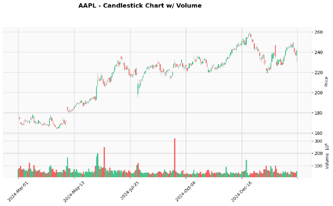
Adding volume is as simple as setting volume=True in our mpf.plot() call. As long as our DataFrame contains a Volume column (which it does), mplfinance will automatically create a volume subplot below the price chart.
This combined visualization now shows us:
- Price action through candlesticks in the upper panel
- Trading volume in the lower panel, color-coded to match price direction
- Red volume bars for down days
- Green volume bars for up days
This lets us identify important patterns like high-volume breakouts or low-volume pullbacks—critical information for making trading decisions.
Plotting only recent OHLCV data #
Often, we want to focus on more recent price action rather than looking at the entire data range. Let’s create a zoomed-in view of the most recent trading days:
# grab only the latest 30 days of trading data
df_latest = df.head(30)
And from there we can plot this subset:
# plot the latest data, thereby creating a "zoomed in" version of the plot
mpf.plot(
    df_latest.xs(ticker),
    type="candle",
    style="yahoo",
    figsize=(14, 7),
    volume=True,
    title=f"{ticker} - Last 30 Days"
)
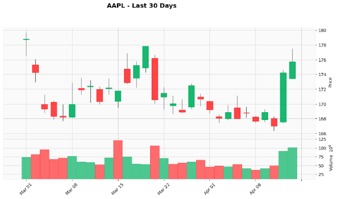
The resulting chart shows only the most recent month of trading — mplfinance automatically adjusts the scaling based on the data provided, giving us a more detailed view of recent price action.
This zoomed-in view makes it easier to analyze short-term patterns and make more immediate trading decisions.
Exercises #
Before we wrap up, try these exercises to reinforce what you’ve just learned:
Cross-ticker comparison: Plot a candlestick chart for a different stock (e.g., MSFT, AMZN, or TSLA) and compare its price action with AAPL. What differences do you notice in volatility, trend direction, and volume patterns?
Custom styling exploration: Create a custom color scheme for your candlestick chart by exploring the
styleparameter options inmpf.plot(). Try creating a dark mode theme for your charts or customize the colors to match your personal preferences.Moving average visualization: Add a 20-day Simple Moving Average to your candlestick chart (hint: look up the
mavparameter inmpf.plot()). Does the price tend to respect this moving average as support or resistance? Try adding multiple moving averages with different periods.High-resolution export: Export your chart as a high-resolution image file using
savefig(). This is particularly useful when creating reports or sharing analysis with others who don’t have Python installed.
Remember, the best way to master these visualization techniques is through hands-on practice—try implementing each example yourself to develop a deeper understanding of how candlestick charts can enhance your market analysis workflows.
Final thoughts #
Visualization is one of the most powerful tools in a trader or analyst’s arsenal. What we’ve covered today—transforming raw OHLCV data into informative candlestick charts—is the foundation for more advanced technical analysis.
With just a few lines of Python code, we’ve created stock charts that reveal price trends, volatility, and market participation. These visualizations help us spot patterns that might be invisible in raw data or simpler line charts.
The mplfinance library makes this process remarkably easy, handling all the complexity of translating OHLC data into meaningful visual representations. And the best part? This is just the beginning of what’s possible.
In the next tutorial, we’ll build on these visualization skills by learning how to compute and plot Simple Moving Averages (SMAs)—one of the most fundamental technical indicators used by traders worldwide.